
[React] 게시판 만들기 #2 : 리액트 프로젝트와 네비에이션(Navigation) 생성
- 리액트로 게시판 만들기
React 소스코드는 여기 에서 확인 가능합니다.
개발에 사용한 Restful API 는 여기 에서 확인 가능합니다.
React 설치
1
2
3
4
5
6
  cd C:\ymk\toynumber\toyseven-react  # workspace 로 이동
  npm install -g create-react-app     # react 설치

  # 본인이 설치 할 경로에 따라 cra(create react app) 실행
  npx create-react-app toyseven-react     # toyseven-react 경로에 cra
  npx create-react-app .                  # 현재 경로에 cra
create-react-app toyseven-react 명령어 에서 toyseven-react 는 애플리케이션 폴더이름이며, React 애플리케이션을 만들고 의존 라이브러리를 설치하는 내용이다.
React 실행
1
2
  cd C:\ymk\toynumber\toyseven-react
  npm start
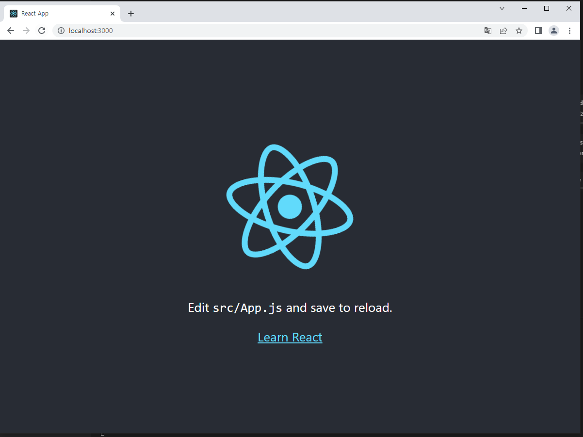
위 명령어를 실행 후 http://localhost:3000/ 로 접속했을때 React 페이지가 나오면 서버가 정상적으로 실행 된 것
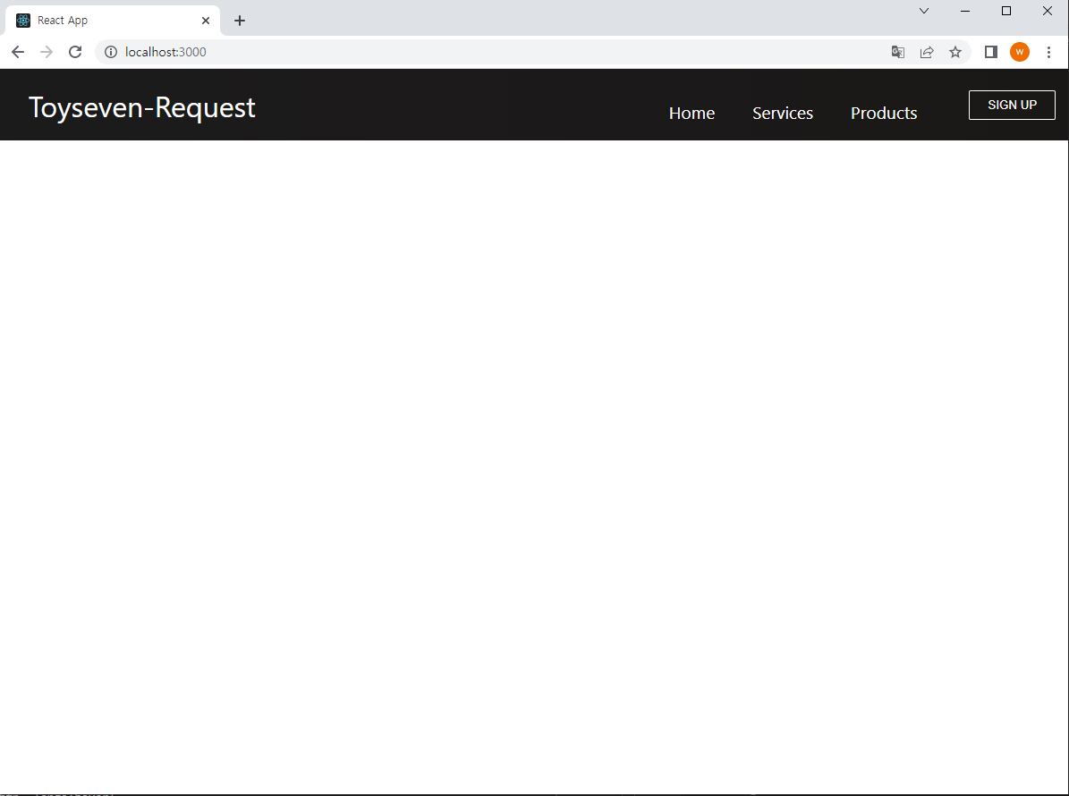
Navigation bar 생성
1
  npm install react-router-dom --save   # 페이지를 이동할 때 필요한 라이브러리
🛠 components/Button.css
1
2
3
4
5
6
7
8
9
10
11
12
13
14
15
16
17
18
19
20
21
22
23
24
25
26
27
28
29
30
31
32
33
34
35
36
37
38
39
40
41
42
43
44
45
46
:root {
    --primary: #fff;
}

.btn{
    padding: 8px 20px;
    border-radius: 2px;
    outline: none;
    border: none;
    cursor: pointer;
}

.btn--primary{
    background-color: var(--primary);
    color: #242424;
    border: 1px solid var(--primary);
}

.btn--outline {
    background-color: transparent;
    color: white;
    padding:8px 20px;
    border: 1px solid var(--primary);
    transition: all 0.3s ease-out;
}

.btn-medium {
    padding: 8px 20px;
    font-size: 20px;

}

.btn--large {
    padding: 12px 26px;
    font-size: 20px;

}


.btn--medium:hover,
.btn--large:hover{
    background: white;
    color: #242424;
    transition: all 0.3s ease-out;

}
🛠 components/Button.js
1
2
3
4
5
6
7
8
9
10
11
12
13
14
15
16
17
18
19
20
21
22
23
24
25
26
27
28
import React from 'react';
import './Button.css';
import {Link} from 'react-router-dom';

const STYLES = ['btn--primary', 'btn--outline'];

const SIZES = ['btn--medium', 'btn--large'];

export const Button = ({children, type, onClick, buttonStyle, buttonSize}) => {
    // buttonstyle이 따로 지정되지 않으면 가장 기본인 배열의 0번째가 설정된다.
    const checkButtonStyle = STYLES.includes(buttonStyle) ? buttonStyle : STYLES[0];
    // buttonsize가 지정되지 않으면 가장 기본 사이즈인 0번재 btn-medium이 설정된다.
    const checkButtonSize = SIZES.includes(buttonSize) ? buttonSize : SIZES[0];

    return (
        // children안에 어떤 내용을 입력해도 버튼 이름이 된다.
        <Link to = '/sign-up' className = 'btn-mobile'>
            <button
            className={`btn ${checkButtonStyle} ${checkButtonSize}`}
            onClick={onClick}
            type={type}
            >
                {children}
            </button>
        </Link>
    );

};
🛠 components/Navbar.css
1
2
3
4
5
6
7
8
9
10
11
12
13
14
15
16
17
18
19
20
21
22
23
24
25
26
27
28
29
30
31
32
33
34
35
36
37
38
39
40
41
42
43
44
45
46
47
48
49
50
51
52
53
54
55
56
57
58
59
60
61
62
63
64
65
66
67
68
69
70
71
72
73
74
75
76
77
78
79
80
81
82
83
84
85
86
87
88
89
90
91
92
93
94
95
96
97
98
99
100
101
102
103
104
105
106
107
108
109
110
111
112
113
114
115
116
117
118
119
120
121
122
123
124
125
126
127
128
129
130
131
132
133
134
135
136
137
138
139
140
141
142
143
144
145
146
147
148
149
150
151
152
153
154
155
156
157
158
.navbar {
    background: linear-gradient(90deg, rgb(28, 27, 27) 0%, rgb(26, 23, 23) 100%);
    height: 80px;
    display: flex;
    justify-content: center;
    align-items: center;
    font-size: 1.2rem;
    position: sticky;
    top: 0;
    z-index: 999;
  }

  .navbar-container {
    display: flex;
    justify-content: center;
    align-items: center;
    height: 80px;
    max-width: 1500px;
  }

  .navbar-logo {
    color: #fff;
    justify-self: start;
    margin-left: 20px;
    cursor: pointer;
    text-decoration: none;
    font-size: 2rem;
    display: flex;
    align-items: center;
  }

  .fa-typo3 {
    margin-left: 0.5rem;
    font-size: 1.8rem;
  }

  .nav-menu {
    display: grid;
    grid-template-columns: repeat(4, auto);
    grid-gap: 10px;
    list-style: none;
    text-align: center;
    width: 60vw;
    justify-content: end;
    margin-right: 2rem;
  }

  .nav-item {
    height: 80px;
  }

  .nav-links {
    color: #fff;
    display: flex;
    align-items: center;
    text-decoration: none;
    padding: 0.5rem 1rem;
    height: 100%;
  }

  .nav-links:hover {
    border-bottom: 4px solid #fff;
    transition: all 0.2s ease-out;
  }

  .fa-bars {
    color: #fff;
  }

  .nav-links-mobile {
    display: none;
  }

  .menu-icon {
    display: none;
  }

  @media screen and (max-width: 960px) {
    .NavbarItems {
      position: relative;
    }

    .nav-menu {
      display: flex;
      flex-direction: column;
      width: 100%;
      height: 90vh;
      position: absolute;
      top: 80px;
      left: -100%;
      opacity: 1;
      transition: all 0.5s ease;
    }

    .nav-menu.active {
      background: #242222;
      left: 0;
      opacity: 1;
      transition: all 0.5s ease;
      z-index: 1;
    }

    .nav-links {
      text-align: center;
      padding: 2rem;
      width: 100%;
      display: table;
    }

    .nav-links:hover {
      background-color: #fff;
      color: #242424;
      border-radius: 0;
    }

    .navbar-logo {
      position: absolute;
      top: 0;
      left: 0;
      transform: translate(25%, 50%);
    }

    .menu-icon {
      display: block;
      position: absolute;
      top: 0;
      right: 0;
      transform: translate(-100%, 60%);
      font-size: 1.8rem;
      cursor: pointer;
    }

    .fa-times {
      color: #fff;
      font-size: 2rem;
    }

    .nav-links-mobile {
      display: block;
      text-align: center;
      margin: 2rem auto;
      border-radius: 4px;
      width: 80%;
      text-decoration: none;
      font-size: 1.5rem;
      background-color: transparent;
      color: #fff;
      padding: 14px 20px;
      border: 1px solid #fff;
      transition: all 0.3s ease-out;
    }

    .nav-links-mobile:hover {
      background: #fff;
      color: #242424;
      transition: 250ms;
    }
  }
🛠 components/Navbar.js
1
2
3
4
5
6
7
8
9
10
11
12
13
14
15
16
17
18
19
20
21
22
23
24
25
26
27
28
29
30
31
32
33
34
35
36
37
38
39
40
41
42
43
44
45
46
47
48
49
50
51
52
53
54
55
56
57
58
59
60
61
62
63
64
65
66
67
68
69
70
71
72
73
import React, { useState, useEffect} from 'react';
import { Link } from 'react-router-dom';
import {Button} from './Button';
import './Navbar.css';

function Navbar() {
    const [click, setClick] = useState(false);
    const [button, setButton] = useState(true);


    const handleClick = () => setClick(!click) ;
    const closeMobileMenu = () => setClick(false);

    // 화면 크기에 따라서 버튼이 보이고 안보이도록 설정한다.
    const showButton = () => {
        if(window.innerWidth <= 960){
            setButton(false)
        }
        else {
            setButton(true);
        }
    };

    // SIGNUP버튼이 사이즈가 줄어들면 없어지도록 한다.
    useEffect(() => {
        showButton();
    }, []);


    window.addEventListener('resize', showButton);

    return (
        <>
        <nav className = 'navbar'>
            <div className = 'navbar-container'>
                {/* 모바일버전에서 클릭하면 메뉴 보이도록 설정하는 것도 한다. (close Mobile Menu)는 다시 버튼 누르면 없어지고 생기고 하도록 한다.  */}
                <Link to='/' className='navbar-logo' onClick={closeMobileMenu}>
                    Toyseven-Request
                    <i className='fab fa-typo3' />
                </Link>
                <div className='menu-icon' onClick={handleClick}>
                    <i className = {click ? 'fas fa-times' : 'fas fa-bars' } />
                </div>
                <ul className={click ? 'nav-menu active' : 'nav-menu'}>
                    <li className='nav-item'>
                        <Link to='/' className='nav-links' onClick = {closeMobileMenu}>
                            Home
                        </Link>
                    </li>
                    <li className='nav-item'>
                        <Link to='/station' className='nav-links' onClick = {closeMobileMenu}>
                            Station
                        </Link>
                    </li>
                    <li className='nav-item'>
                        <Link to='/voc' className='nav-links' onClick = {closeMobileMenu}>
                            Voc
                        </Link>
                    </li>
                    <li className='nav-item'>
                        <Link to='/sign-up' className='nav-links-mobile' onClick = {closeMobileMenu}>
                            Sign Up
                        </Link>
                    </li>
                </ul>
                {button && <Button buttonStyle='btn--outline'>SIGN UP</Button>}
            </div>
        </nav>
        </>
    );
}

export default Navbar
🛠 App.js
1
2
3
4
5
6
7
8
9
10
11
12
13
14
15
16
17
18
19
import React from 'react';
import {BrowserRouter as Router, Route, Routes} from 'react-router-dom';
import Navbar from'./components/Navbar';

function App() {


    return (
      <>
      <Router>
        <Navbar />
        <Routes>
          <Route path='/' exact />
        </Routes>
      </Router>
      </>
    );
}
export default App;
댓글남기기